
Client: Le Petit Pera
Industry: Cafe & Restaurant
Location: İstanbul, TR
Scope: Brand Identity & Packaging
Year: 2023
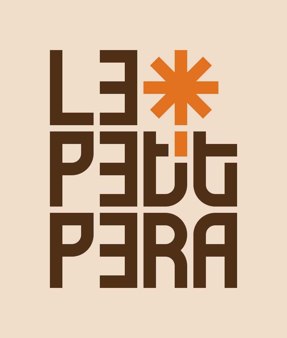
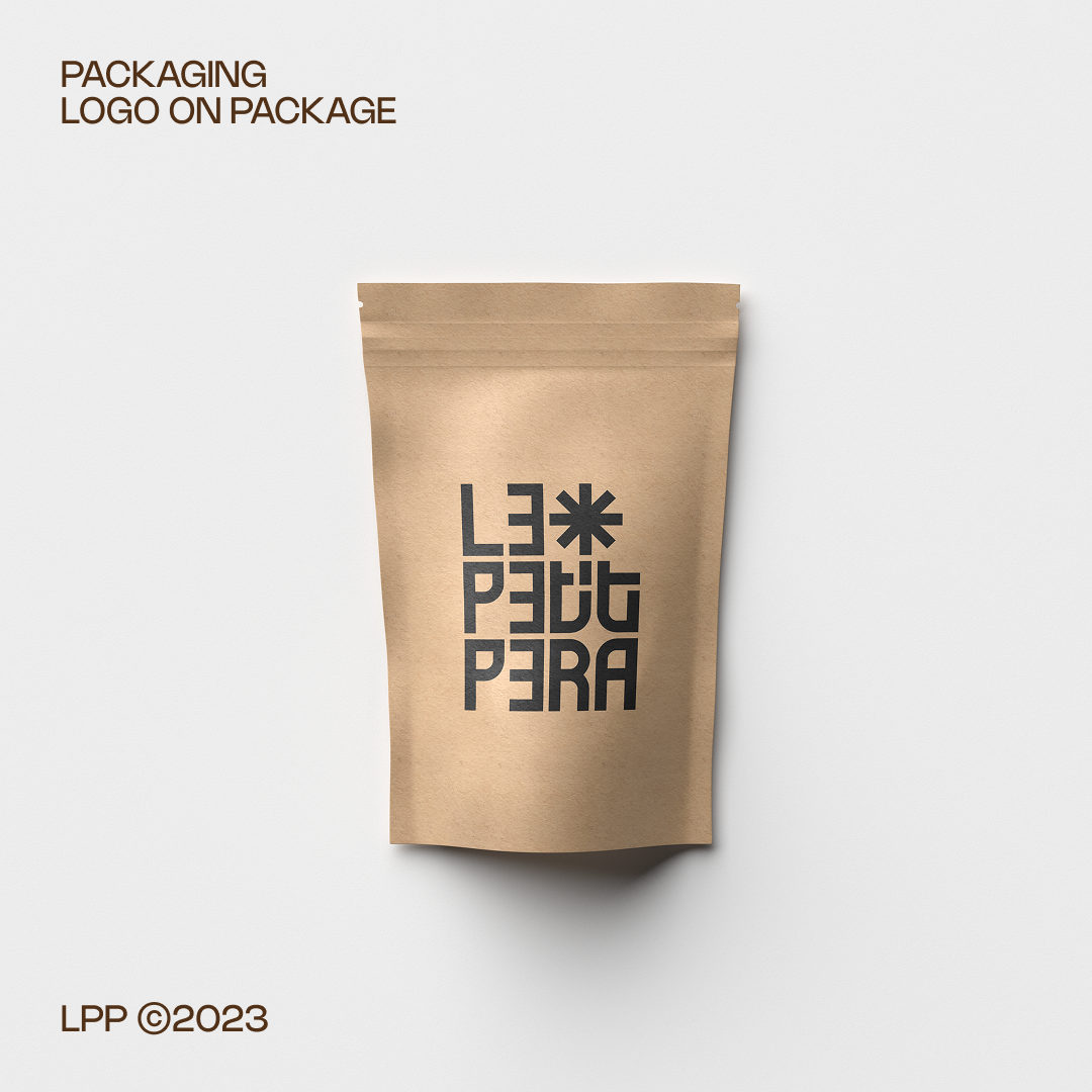
Le Petit Pera brings rich flavors and aromatic coffee to the vibrant streets of Karaköy. To reflect its warm and inviting atmosphere, we created a clean and sophisticated visual identity that captures the essence of the brand.
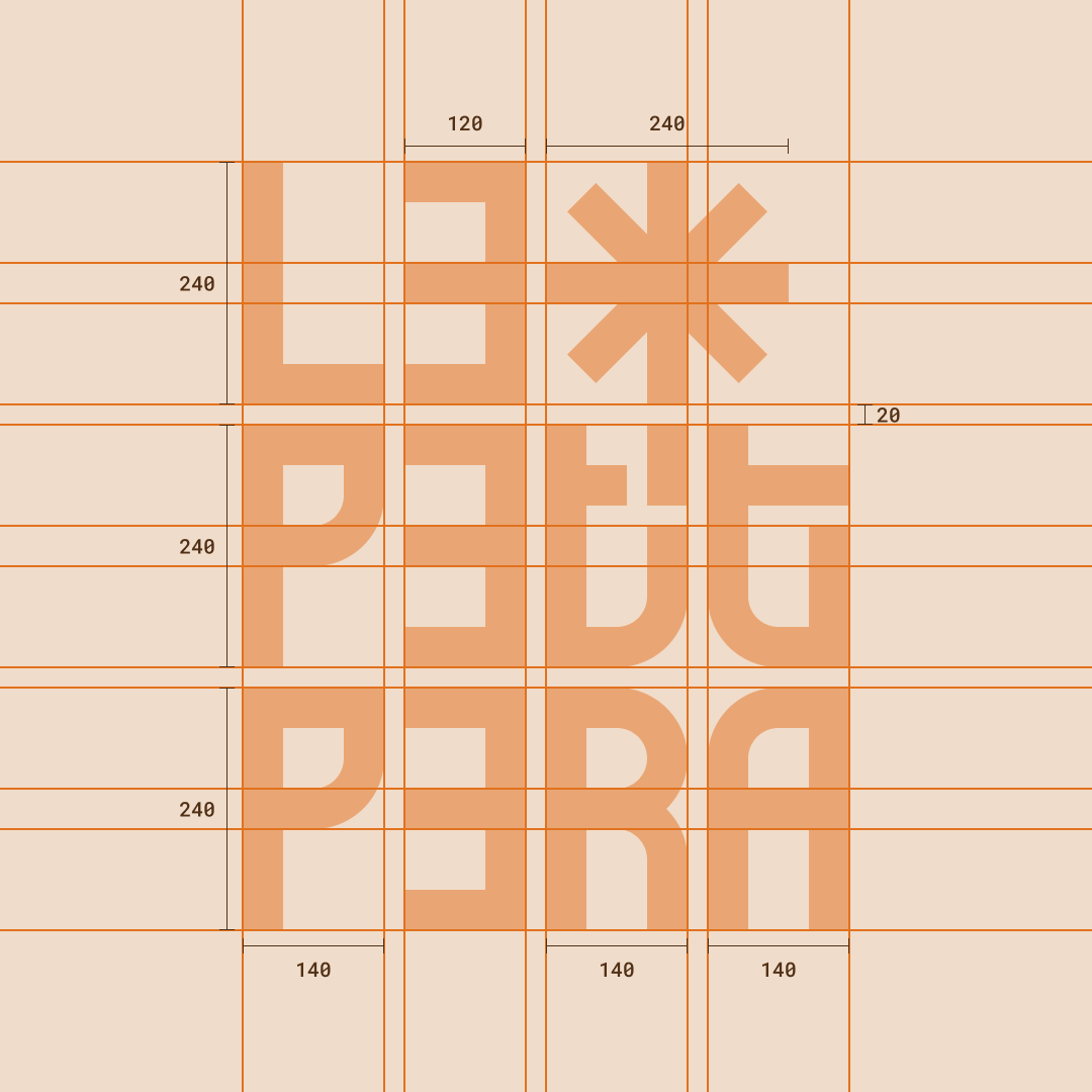
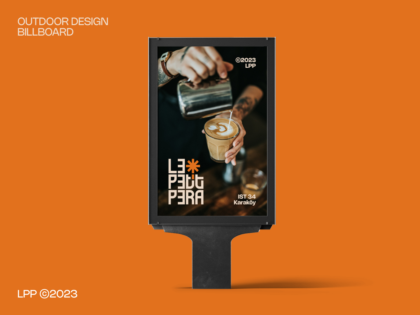
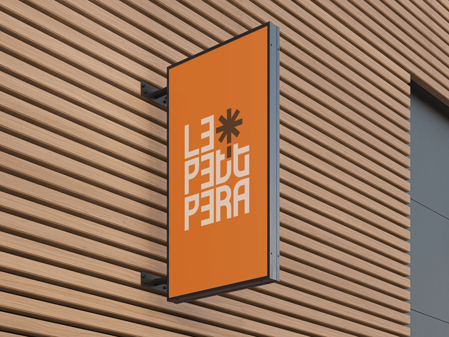
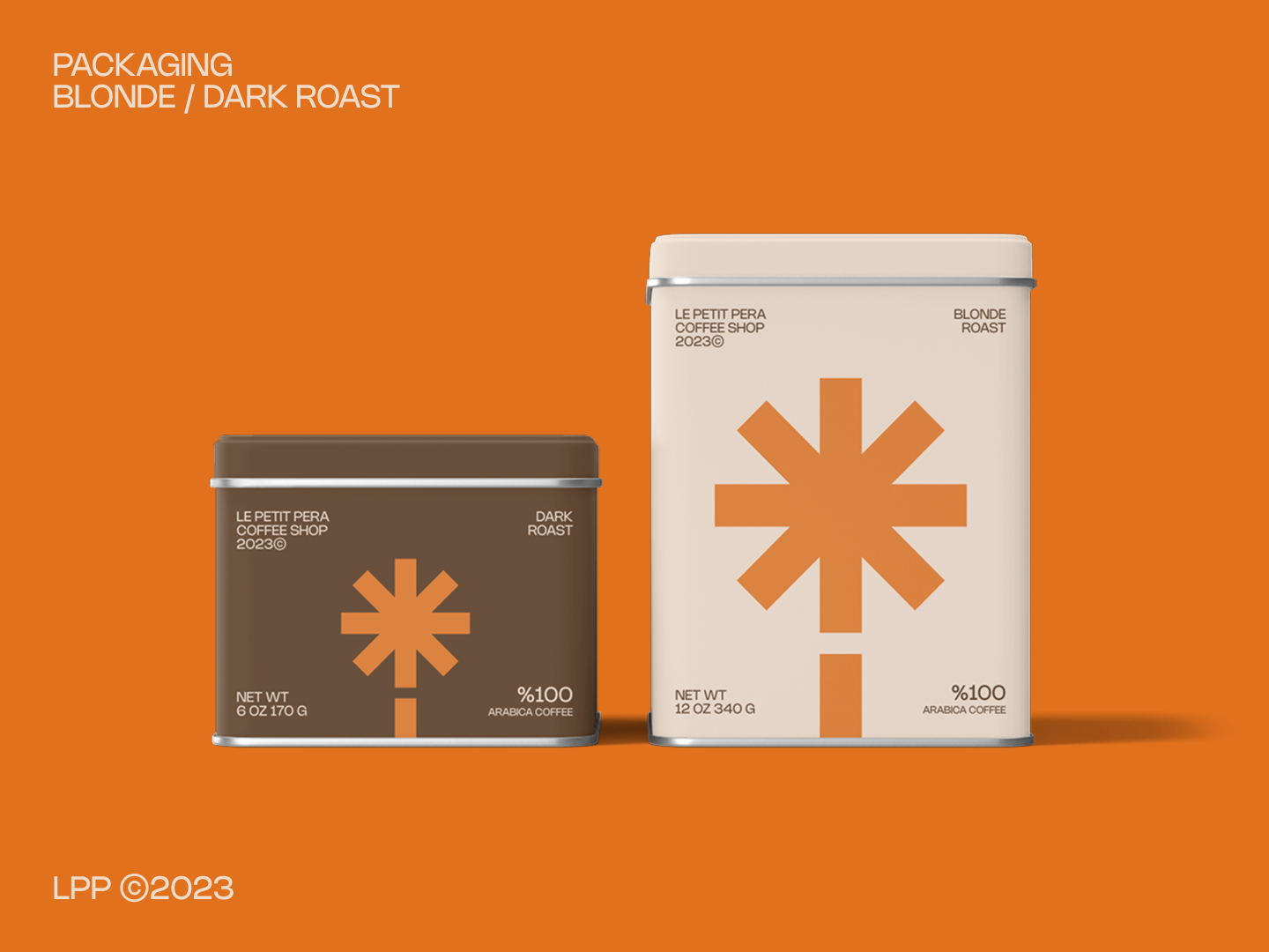
For the logotype, we structured the name into three lines, creating a well-balanced aspect ratio between height and width. A distinctive mark above the letter ‘i’ symbolizes international flavors and directional movement, while also introducing a secondary color accent.
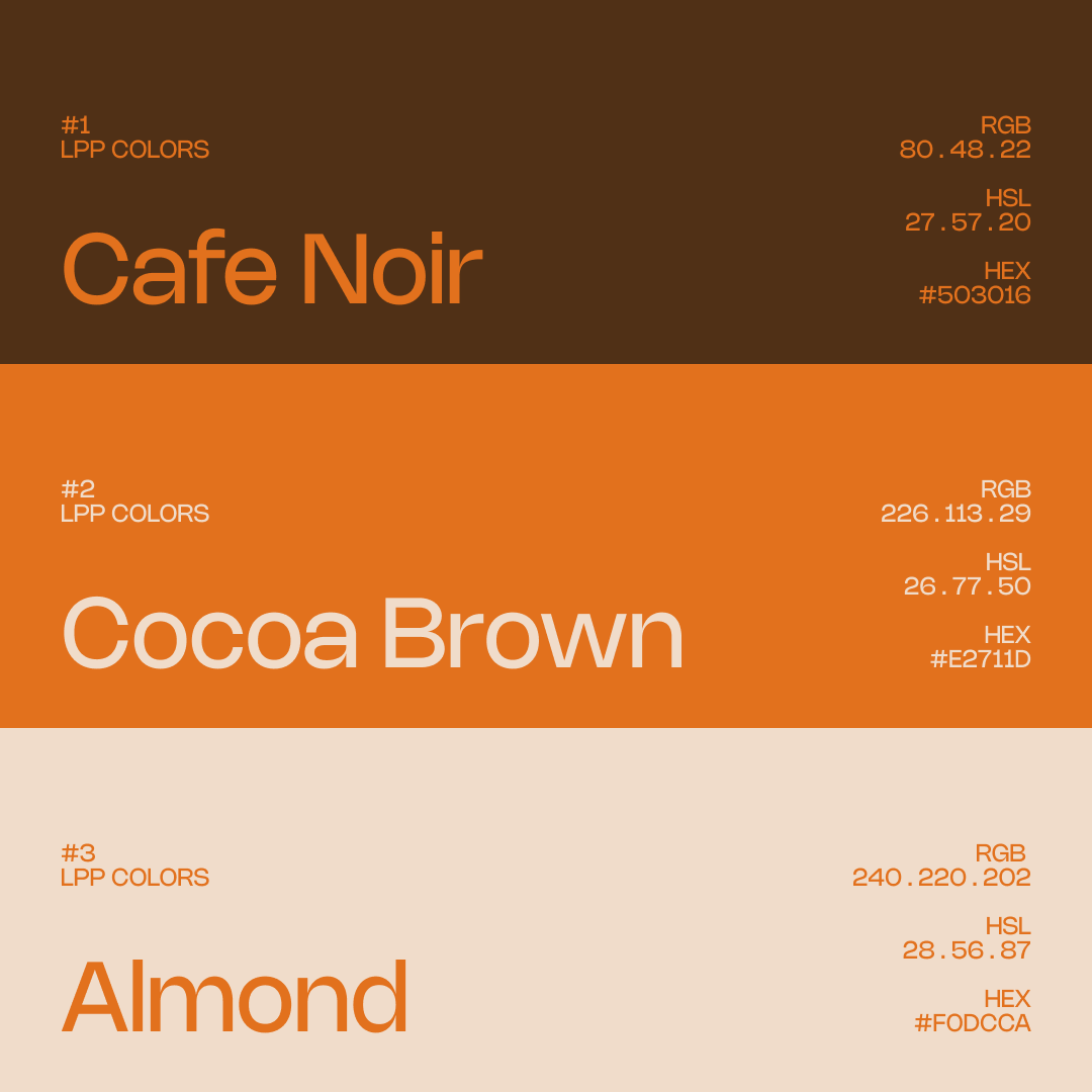
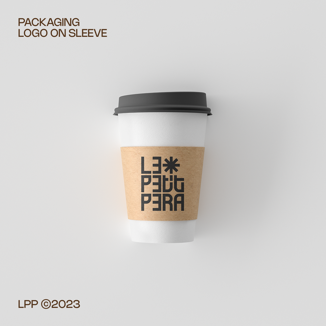
The color palette, inspired by classic coffeehouse tones, blends Cocoa Brown for energy, Almond for warmth, and Café Noir for depth. To enhance brand consistency, I incorporated the signature star mark from the logo onto coffee packages, emphasizing the brand’s bold orange accent. To ensure versatility across various applications, we developed alternate logo variations optimized for both indoor and outdoor environments, including billboards and signage.


Thank you for watching!
Designed by fatih.studio
©2023
Follow me for more